Interior Paint Color Trends for 2019
Pittsburgh’s guide to Pantone’s picks for home decor.
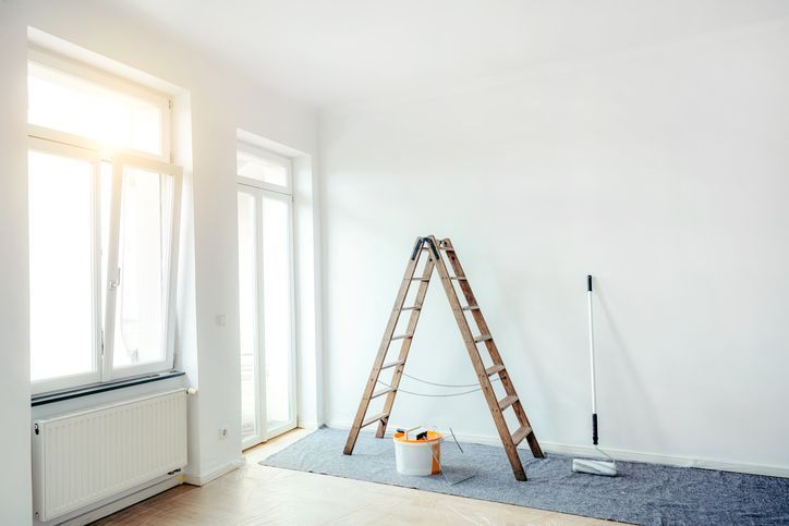
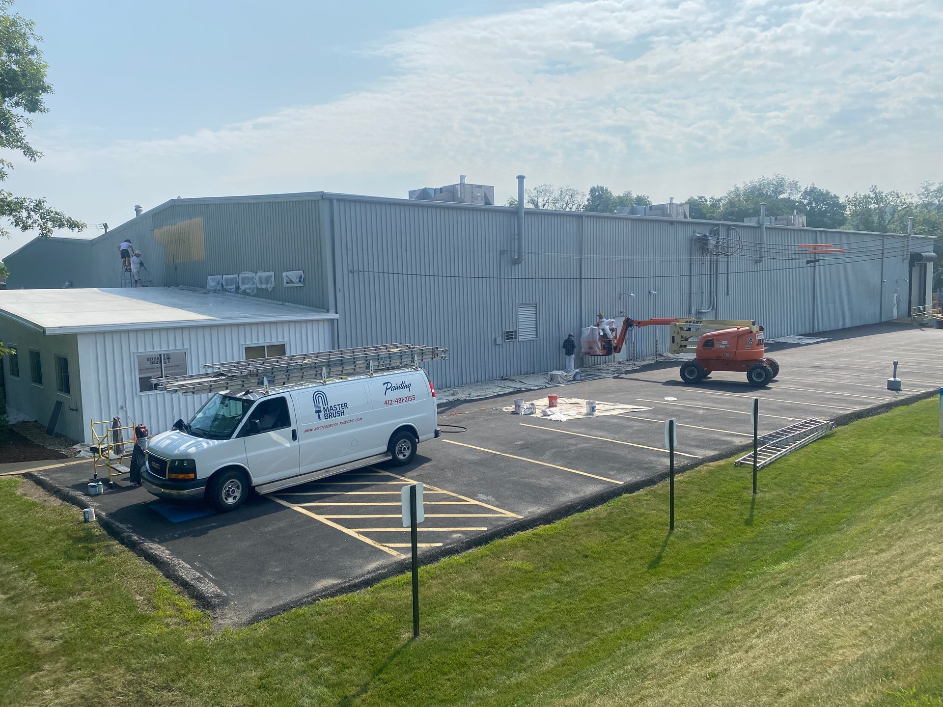
There’s simply nothing better than a fresh coat of paint. With winter on the brink of becoming a distant memory, soon we’ll be opening the windows, throwing down the drop-cloths and getting our paint brushes ready for an interior overhaul. Pittsburgh’s residential painters at MasterBrush Painting have consulted the Pantone Color Institute – the company that defines all color trends – and found this year’s color pallet is an eclectic spin on the classics. While trendy paint colors come and go, this year’s picks are colors that will meld easily into your existing décor and go with future trends that will come out in the upcoming seasons.
So, let’s look at what’s hot for 2019!
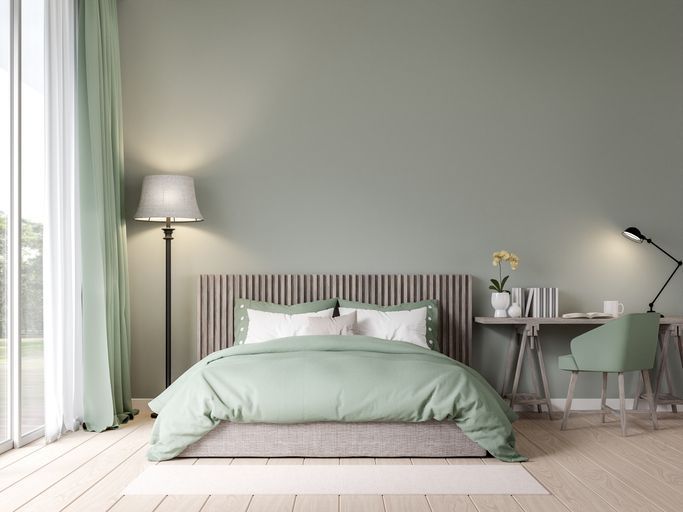
Lilac Grey
Variations of grey are always in style. This shade of grey makes other hues of grey look warmer, gender neutral and happy. Greys are safe colors used by many interior designers, and this version has enough oomph to it, without it getting old too quickly.
Dark Green
The Pantone Color Institute was clear on this one, this is NOT the hunter green of the 1990s. This year’s saturated green mimics leafy greens found in botanical gardens and nature. Unless you’re looking to create a darker effect in a particular area, the color may seem too dark if incorporated into a smaller room, say a powder room with no windows. However, if you have a large room or one with a ton of natural light, this is a great color choice to really showcase the deep color saturation.
Hazelnut
Shades of hazelnut are great in rooms that need a little pick-me-up. They also work well where you’d like to create the illusion that a room is larger than it really is. Pay attention to the space in the room that gets the most sunlight, as hazelnut is great for reflecting light and creating a warm tone.
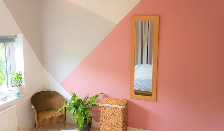
Muted Pastels
Create a warm backdrop in common areas like the kitchen or bath by using muted pastels. These neutral-tones hide scuffs and hand prints which are daily occurrences in any home. They’re also great for rooms where you want to create dramatic accents like a navy-blue backsplash or a vibrant accent wall.
Clay tones
Think earth tones, but not basic beige and brown. Shades of terra cotta, burnt orange, and clove evoke a bright, yet relaxed feeling to a room. These hues are a great choice in a room where you want to make the space pop, but on an earth-tone level.
New Blues
Traditionalists who are open to adding a bit of color, but don’t want to overwhelm a room, can choose from a pallet of new blues that include charcoal blue, gray-blue, ice blue and pale powder blue. Colors choices from the new blue hues will give your room a fresh makeover, but without going out of style by next season.
Mustard
Quite possibly the most vibrant color of Pantone’s 2019 picks is deep, golden yellow that gives off a warm, floral vibe. This color is great for smaller areas like an accent wall, backdrop to built-in shelving or trim. Artists and designer agree, sometimes the most captivating colors are those used the least.
Color trends are ever-changing, so if you’re a traditionalist the 2019 color choices are right up your alley. They will also, however, satisfy even the most vibrant color enthusiast.
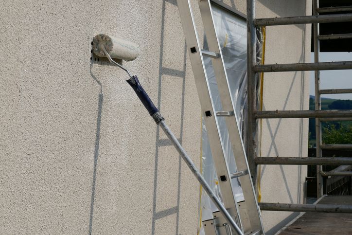
If you are ready to paint your interior, don’t do it alone! Call the Pittsburgh residential painters at MasterBrush Painting f or all your interior painting needs. We’ll help you with your choices and provide you with quality work. Call us at 724-260-0486 for a FREE CONSULTATION.
Author:
Henry Weber
Before starting Master Brush Painting in 1981, Henry worked at one of the top painting companies in Pittsburgh where he learned the trade from world-renowned experts. Since then expertise has satisfied clients in Pittsburgh and surrounding area as well as earning him awards such as the Angie's List Super Service Award.